Gammill stand-up longarm machines on a stationary frame. These classes are on Monday 1014R Fun Feathers that Fit Anywhere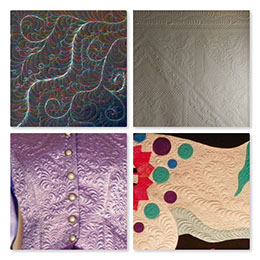 and Tuesday: 2014R Easy Background Fillers for Longarm Quilters
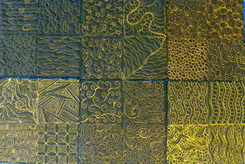 Kristin will also be teaching a class on Wednesday where Brother machines will be provided for each student’s use: 3016C Easy English Paper Piecing by Machine
 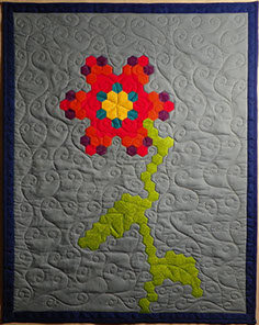 Then, on Wednesday evening, Kristin will be teaching a design class (no machine necessary) 3068C So I got it pieced, now what?
  A Lincoln, Nebraska native and former University of New Mexico nursing teacher, Kristin Vierra has also lived in California, Arizona, Florida, Colorado, Iowa, D.C., Tennessee, and Louisiana before returning back to her roots in Lincoln about 10 years ago.
 Kristin’s great-grandma taught her mom how to quilt and in turn, Kristin’s mom taught Kristin how to sew. As Kristin says, she has always sewn in one form or another, and even made an occasional baby blanket. Kristin tried hand quilting but thought hers “never looked right; instead of nice even stitching, I had Morse code. You know, dot, dot, dash, dash, dash.” She also felt that she never seemed “coordinated enough to quilt on a domestic.” Plus, it always made her shoulders ache on big projects. When Kristin moved back to Lincoln, she “was lucky enough to find a used Gammill Longarm. That was when I really actually started quilting. My longarm and I just clicked and the rest as they say is history.”
Kristin finds inspiration for her quilting literally “everywhere.” It drives her husband and kids nuts because she has been known to come out of a bathroom and ask for the camera because there was a particularly cool tile that she wanted to use as inspiration for a quilt. Architecture, carpets, nature, designs on people’s clothes— all are fair game to Kristin when it comes to quilting.
Kristin’s great-grandma taught her mom how to quilt and in turn, Kristin’s mom taught Kristin how to sew. As Kristin says, she has always sewn in one form or another, and even made an occasional baby blanket. Kristin tried hand quilting but thought hers “never looked right; instead of nice even stitching, I had Morse code. You know, dot, dot, dash, dash, dash.” She also felt that she never seemed “coordinated enough to quilt on a domestic.” Plus, it always made her shoulders ache on big projects. When Kristin moved back to Lincoln, she “was lucky enough to find a used Gammill Longarm. That was when I really actually started quilting. My longarm and I just clicked and the rest as they say is history.”
Kristin finds inspiration for her quilting literally “everywhere.” It drives her husband and kids nuts because she has been known to come out of a bathroom and ask for the camera because there was a particularly cool tile that she wanted to use as inspiration for a quilt. Architecture, carpets, nature, designs on people’s clothes— all are fair game to Kristin when it comes to quilting.  While she uses many quilting tools, Kristin’s favorite is her design board. She had it custom made out of clear plexiglass with registration marks to help her divide up blocks. Kristin places it on top of a quilt and draws on it with dry erase markers. It makes it really easy to audition designs, without having to mark the quilt or even worse rip out stitches. She’ll be demonstrating this tool in her “So I got it pieced, now what?” class.
Her best quilting tip is “don’t be afraid to try.” Kristin admits that “some of my coolest creations have come from my biggest mistakes.”
Kristin’s favorite aspect of teaching is “that moment when you can see the ‘light bulb’ go on in someone’s head.” All of a sudden, “some concept or technique they have been struggling with becomes clear and they get so excited.” For Kristin, that’s the absolute best feeling to be a part of.
What does Kristin hope her student get out of her classes? “I want them to go away inspired and excited about whatever project they are going to work on next. It doesn’t matter if you are making cuddle quilts or the next BOS winner. All that matters is that you are enjoying yourself and having fun.”
To learn more about Kristin, please visit her website.]]>
While she uses many quilting tools, Kristin’s favorite is her design board. She had it custom made out of clear plexiglass with registration marks to help her divide up blocks. Kristin places it on top of a quilt and draws on it with dry erase markers. It makes it really easy to audition designs, without having to mark the quilt or even worse rip out stitches. She’ll be demonstrating this tool in her “So I got it pieced, now what?” class.
Her best quilting tip is “don’t be afraid to try.” Kristin admits that “some of my coolest creations have come from my biggest mistakes.”
Kristin’s favorite aspect of teaching is “that moment when you can see the ‘light bulb’ go on in someone’s head.” All of a sudden, “some concept or technique they have been struggling with becomes clear and they get so excited.” For Kristin, that’s the absolute best feeling to be a part of.
What does Kristin hope her student get out of her classes? “I want them to go away inspired and excited about whatever project they are going to work on next. It doesn’t matter if you are making cuddle quilts or the next BOS winner. All that matters is that you are enjoying yourself and having fun.”
To learn more about Kristin, please visit her website.]]>
Posts Tagged ‘Quilt Design’
Meet Road 2018 Teacher Kristin Vierra
Monday, August 28th, 2017Color and Quilting
Monday, July 18th, 2016 2017 Road Teacher, Michele Crawford, knows a lot about color and quilting. A quilt designer since 1989, Michele presented a $5.00 lecture at Road 2016 on The Value of Color which explored the use of color value to enhance quilt design.
[caption id="attachment_4175" align="aligncenter" width="368"] Photo by Brian Roberts Photography[/caption]
Michele began her lecture talking about the psychology of colors which often dictates what a person wears, lives with, and puts in their quilts:
Photo by Brian Roberts Photography[/caption]
Michele began her lecture talking about the psychology of colors which often dictates what a person wears, lives with, and puts in their quilts:
Red: action, confidence
Pink: romance, tranquility
Orange: close relative to red; sets apart from surroundings
Yellow: happiness, optimism
Green: soothes, relaxes
Blue: calm, cool, trustworthy
[caption id="attachment_4177" align="aligncenter" width="336"] Photo by Brian Roberts Photography[/caption]
Purple: uplifts, spirituality
White: hope, purity
Black: power, authority
Grey: knowledge, wisdom
When creating a quilt, color provides the basic design principles: Movement, Repetition, and Variety. Michele gave some added tips for repetition and variety. She said a Resting Spot should always be included in a quilt including a different color or value or border. She also warned about not having the quilt be too busy. If a quilt is too busy, it’s not pleasant to view because the eye is constantly wandering. And because variety is the spice of life, a zinger color (something not even in the quilt or border) can “make the quilt” sparkle. The color wheel is divided into 3 categories that are considered the pure colors: Primary colors – red, yellow and blue with (*Yellow being the most dominant pure color) Secondary colors – orange, green and violet Tertiary colors – red/orange, red/violet, yellow/green, yellow/orange, blue/green and blue/violet Complimentary Colors appear on opposite sides of a color wheel – red/green for example. Black is the mixture of all the pure colors. White is the absence of color. The true neutrals are the achromatic colors: black and white plus grey. The rule of thumb to remember when working with pure colors is that LIGHT ADVANCES ON DARK and DARK ADVANCES ON LIGHT. [caption id="attachment_4176" align="aligncenter" width="336"]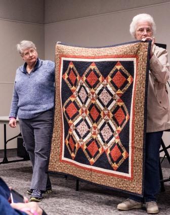 Photo by Brian Roberts Photography[/caption]
Color Value refers to how light or dark a color is. Michele said that understanding this concept is vital in making effective scrap quilts. Quilts will be more interesting not if the colors (or fabrics) do not match, but rather when different colors work together when they are in the same color value.
[caption id="attachment_4173" align="aligncenter" width="336"]
Photo by Brian Roberts Photography[/caption]
Color Value refers to how light or dark a color is. Michele said that understanding this concept is vital in making effective scrap quilts. Quilts will be more interesting not if the colors (or fabrics) do not match, but rather when different colors work together when they are in the same color value.
[caption id="attachment_4173" align="aligncenter" width="336"]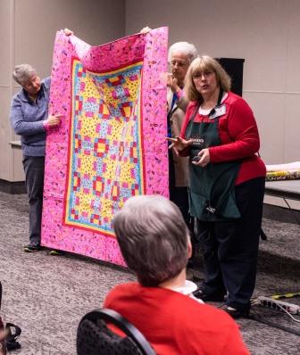 Photo by Brian Roberts Photography[/caption]
Every fabric in a certain color can be divided into three main groups: LIGHT, MEDIUM, and DARK. Within these groups, they can be subdivided again into three separate areas of light, medium and dark (i.e. light-light, medium-light and dark-light).
Light: Fabrics in these colors (white, cream, ecru, etc.) are effective as backgrounds, for contrast and to soften the look of a quilt.
Medium: Fabrics in these colors (medium blue, red, green, etc.) provide a rich look as a blender or contrast between light and dark fabrics.
Dark: Fabrics in these colors (black, navy, forest green, etc.) create a strong bold contrast. These are the colors that are going to pull together all the rest of the colors or “pop” in a quilt and are good for borders.
[caption id="attachment_4174" align="aligncenter" width="364"]
Photo by Brian Roberts Photography[/caption]
Every fabric in a certain color can be divided into three main groups: LIGHT, MEDIUM, and DARK. Within these groups, they can be subdivided again into three separate areas of light, medium and dark (i.e. light-light, medium-light and dark-light).
Light: Fabrics in these colors (white, cream, ecru, etc.) are effective as backgrounds, for contrast and to soften the look of a quilt.
Medium: Fabrics in these colors (medium blue, red, green, etc.) provide a rich look as a blender or contrast between light and dark fabrics.
Dark: Fabrics in these colors (black, navy, forest green, etc.) create a strong bold contrast. These are the colors that are going to pull together all the rest of the colors or “pop” in a quilt and are good for borders.
[caption id="attachment_4174" align="aligncenter" width="364"]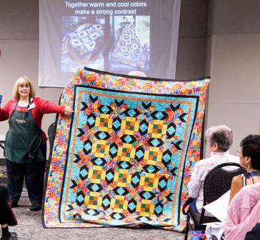 Photo by Brian Roberts Photography[/caption]
When deciding on the colors for a quilt, Michele recommended starting with the block design first and pull the colors to the outside of the quilt. Whatever colors are used in the center of a quilt should be the border fabric/color.
To learn more about Michele and her quilt designing, please visit her website.]]>
Photo by Brian Roberts Photography[/caption]
When deciding on the colors for a quilt, Michele recommended starting with the block design first and pull the colors to the outside of the quilt. Whatever colors are used in the center of a quilt should be the border fabric/color.
To learn more about Michele and her quilt designing, please visit her website.]]>